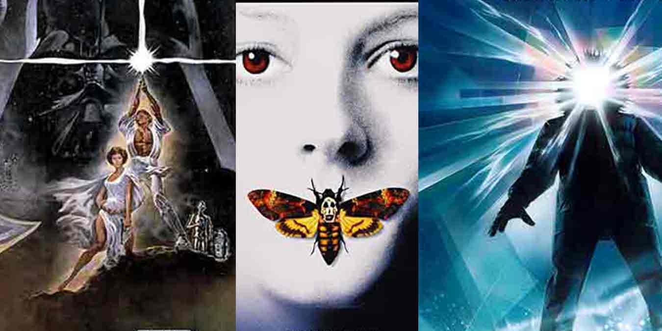
Movie posters are an artform unto themselves. In order to effectively advertise a piece of art, you need to create an equally evocative piece of art that works as both a sample of what you can expect while also leaving enough mystery for you to want more. It needs to be eye-catching but restrained. In our modern times this type of advertising is more on the shoulders of the trailers, rather than the posters, who nowadays are more focused on being a large kaleidoscopic image of the films cast, more often than not superimposed behind a central location. However, along with many of the classic posters found on this list, there are still a few modern posters that carry that alluring and mystical nature.
Want to check out a completely different yet equally fascinating form of advertising? Check out these weird and crazy 90s TV ads
10. The Thing
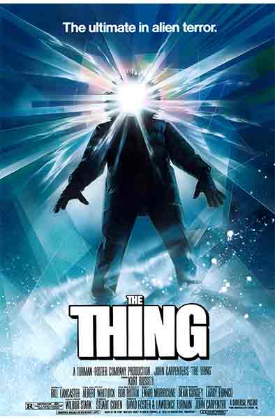
To offset the red, bloody, wriggling mass of tissue of the alien from The Thing, artist Drew Struzan chose to focus on the stark whiteness of the artic landscape of the film’s setting instead. It would’ve been so easy to make a dark, black and red poster that showcased the film’s slimy special effects and memorable shape-shifting monster. However, simply by keeping everything white, from the uniform impact text of the film’s title, to the pure white light emitting from the artic researcher’s hood, Struzan makes a poster that lets you know that something terrifying is hidden behind all of that white.
9. Hereditary
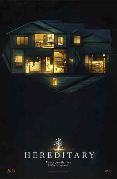
The alternate movie poster for Ari Aster’s 2018 film Hereditary is a good example of a poster that focuses on a reoccurring symbol of the film without really letting you know that’s what it’s doing. No spoilers for Hereditary, but pretty early on they introduce us to a doll house motif that continues to pop up throughout the film, likening the characters to toys being manipulated by some greater force. The placement of a floating mirrored house with rooms that are all oriented at different and impossible angles, upon a backdrop of darkness creates an eerie sense of something sinister without coming right out and saying it.
8. Pulp Fiction
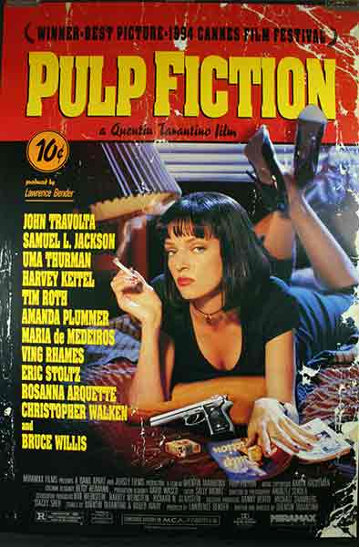
You might recognize this poster from the one million college dorm rooms it’s currently hanging in. It’s a great poster, and there is a lot t0 unpack. First off, stylizing the poster to look like the cover of an old and used pulp magazine really creates the aesthetic that director Quentin Tarantino was going for. Second, Uma Thurman’s Mia Wallace looks into the camera smoking a cigarette and gives her best “girls like me don’t make invitations like this to just anyone” look while she sits on a bed littered with various items that foreshadow the film’s plot. These two elements powerfully entice you to want to know more, without actually revealing any of the film’s plot to you.
7. BlackkKlansman
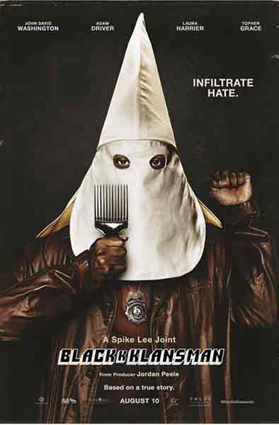
Truly a graphic image that communicates the entire premise of the movie quicker than any elevator pitch could. It counterbalances to startling image of a hooded Klansman with the raised fist for black power and while holding a hair pick the way you would a torch. The movie’s title also immediately gives you everything you need to know, and the placement of an extra K to connect both the K’s in “Black” and in “Klansman” is another nice artistic touch. Everything down the the “based on a true story” credit showcases that you are in for a poignant dark comedy.
6. Mother!
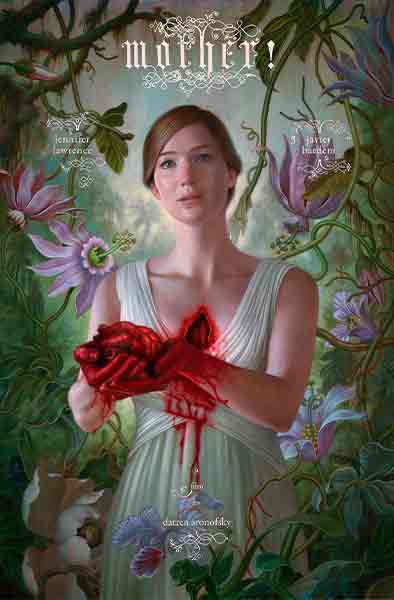
Daron Aronofsky’s Mother! utilizes a single startling image of a young woman standing in an wild and untamed garden and presenting the bleeding heart she seems to have cut out of her own chest to some off camera presence is as unnerving as it is beautiful. The gothic font of the movie’s title, credited actors and director, along with the oil painting look give this film an old, almost Renaissance quality to it. Daring audiences to see this film to find out how all of this connects together.
5. Star Wars
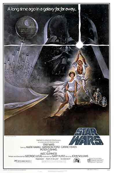
One of the most iconic films of all time of course has one of the most iconic posters of all time. If you were anyone even remotely interested in the sci-fi/fantasy genre and you saw this poster, you probably didn’t even need a trailer to be one hundred percent on board. Of course we look at this poster now and we know what each part means. We know the Death Star, we know Darth Vader, we recognize those two sarcastic little droids and we know Luke is holding a powerful weapon known as a Lightsaber, but if you’re a movie goer in early 1977 you knew none of this. To you, this poster is just a smorgasbord of enthralling Sci-Fi imagery. The only part of this poster that doesn’t deliver when actually viewed on screen is just how ripped Luke Skywalker appears to be.
4. Silence of the Lambs
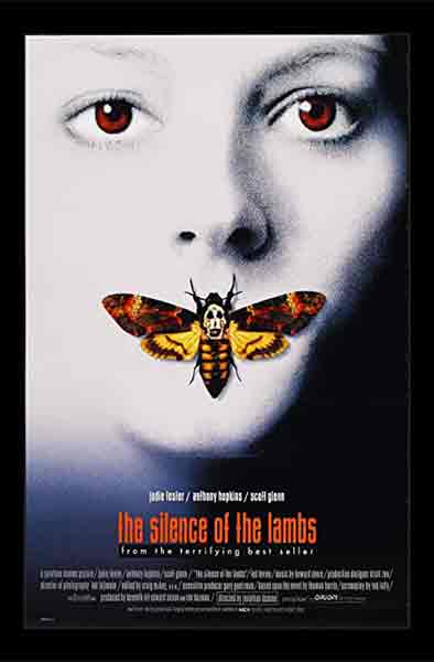
Another simple yet effective poster that has a lot of intricate details baked inside of it. The first being that the moth that covers Clarice Starling’s mouth (which, just that by itself is a perfect symbol to represent the dark thriller) is a Death’s Head Moth, identifiable by the skull marking between its wings. However, beyond that, the image gets even deeper. Upon closer inspection, the skull on the moth’s thorax is actually the famous painting by Salvador Dali in which a skull shape is made up of the bodies of seven nude women. An extremely small detail, and one very easy to miss. However, for those viewers who do notice this on the first viewing are immediately hooked as to what the implications of this image could be.
3. OId
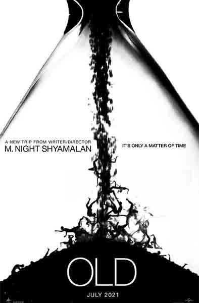
For this one, remember that this is a list of the best film posters and not the best films. While M. Night Shyamalan’s 2021 film Old didn’t perform as well as other movies on this list, the initial teaser poster is something of a masterpiece. So just pretend like it’s late 2020 and none of us have actually seen Old yet. This poster perfectly captures the very real and very relatable human fear that is the unstoppable passage of time. Each silhouetted human body is intricately describing feelings of panic, agony, and fear, all while being buried by more and more of the same. If separated from its titles and credits, this image alone would be equally at home in the post-modern section of an art museum.
2. Jaws
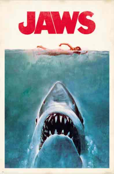
When considering movie poster creation as an artistic process unto itself, Steven Spielberg’s Jaws checks off nearly every box. There’s the focal point of the poster: an enormous shark headed directly for an unsuspecting swimmer. In a world where there had never been a movie about a giant shark who eats people, this was the most horrifying and alluring thing you saw on whatever day you saw it. The subtle red, white, and blue color scheme is giving the poster a classic Americana feeling to it, a feeling that no doubt will be subverted by, you guessed it, a giant shark who eats people. Also the placement of a big red title right above the soon-to-be-shark-food swimmer secretly gives your brain the image of the coming bloodbath without actually depicting it on the poster *chefs kiss*
1. Alien
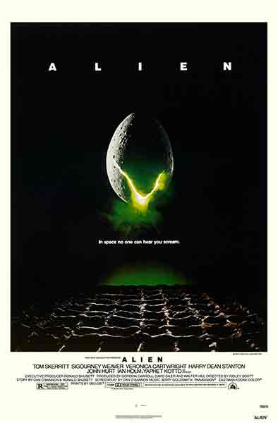
This is the poster that is the definition of peak efficiency. Everything about it is simple and everything about it is effective. What’s the title? “Alien“. Simple, one word, very broad. The focal point? A single egg, cracked and spilling green light, “What’s in the egg?” Probably an alien! “Do we think the Alien will be friendly?” I don’t know, lets check the tagline!
“In space no one can hear you scream.”
Okay! got it! Not a friendly alien. We should all be afraid of this egg and whatever nightmare comes out of it. If you were the movie going audience of 1979, you don’t have the internet so there is no way for you know what is to come unless you see the movie. The poster simply shows you an egg, a title, and a threat. How could you not want to know more?
More aliens? check out this list of the best alien invasion movies

